Authors’ note: This piece expands on themes from our Touchpoint article, Access Freely: Collaborative Service Design for Inclusive Library Experiences. In that article, we explored a decade of partnership between Harmonic Design and Richland Library. Here, we take a step back—not to talk about libraries specifically, but to share how our early work in cultural institutions shaped our view of inclusive design and accessibility. We offer this as a reflection of our roots and look forward to where service design still needs to go. Order a copy here.
From Aquariums to Service Design: Lessons in Inclusive Practice
Equity in service design isn’t simply about checking accessibility boxes. It’s about intentionally designing systems and experiences that remove structural barriers and serve the full diversity of users. Our early careers in exhibit design at cultural institutions taught us how to do just that.
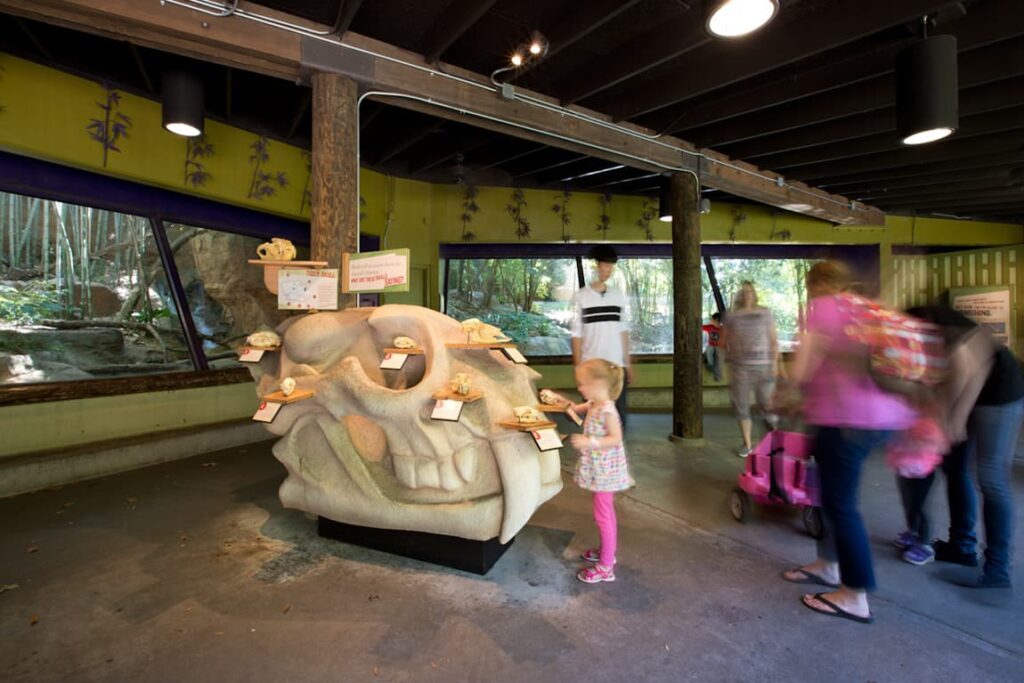
Leah Berg spent time at the National Aquarium in Baltimore, and Becky Scheel at Zoo Atlanta. In both spaces, we learned not only about fins and feathers but also how ADA guidelines—often seen as limitations—could be catalysts for better design. Font size, reach ranges, ramp grades: these constraints didn’t restrict creativity; they enhanced it. They made the design more thoughtful, functional, and welcoming to all.
“Here is one of the few effective keys to the design problem: the ability of the designer to recognize as many of the constraints as possible.”
— Charles Eames

Scheel’s work included tactile interactives for blind and low-vision guests and quiet zones for visitors with sensory sensitivities. These features weren’t add-ons—they were core to making spaces more usable, enjoyable, and emotionally safe. Similarly, Berg’s team at the Aquarium prototyped a full-scale interactive wall and invited families to test it, ensuring the experience was intuitive across age, height, and ability.
These experiences made clear that inclusion must be embedded in the design from the start, not layered on later.
Designing for Functional and Emotional Needs
In museums, we often plan for multiple audiences at once—families, school groups, solo visitors—each with different attention spans, physical needs, and emotional goals. That same mindset applies in service design. We’re not just designing interactions—we’re designing experiences that meet people where they are, across contexts and conditions.
Berg’s master’s thesis on historic house museums proposed “dynamic interpretation”: using sensory design to connect visitors to the past in deeply personal ways. As a service designer now, she sees that early work as accessibility design in action—broadening access by honoring how people relate, remember, and learn differently.
“As rapidly as our understanding of history is changing and evolving, so should the interpretation of historic house museums so that they remain current and relevant to their visitors. Visitors should recognize how their own experiences can align with the stories of the people of the past. Rather than focusing heavily on physical exhibit elements and interactives, this thesis proposes that historic houses consider and focus on ‘dynamic interpretation’ (the intersections of interpretation and exhibition design) to uncover the unexpected magic that comes from activating all or some of the senses.”
– Berg, Something is Happening Here: Dynamic Interpretation for Historic House Museums.

What Equitable Design Actually Looks Like
While much emphasis has been placed on physical accessibility, the design of intangible services warrants equal consideration. Services are often developed with an “average” user in mind—typically without mobility impairments, language barriers, or financial constraints—which can inadvertently marginalize many individuals.
We’ve found that truly equitable design tends to involve a few consistent practices:
- Co-creation with the people you aim to serve
- Proactive identification of barriers, especially the invisible ones
- Iterative, small-scale testing that meets people where they are
It also involves moving beyond the myth of the “average user.” Too often, services are designed with assumptions about language, literacy, tech access, or financial stability that exclude many. This is why the curb-cut effect—the idea that designing for the most excluded helps everyone—still rings true.
Designing with Anticipation, Not Assumptions
Thoughtful service design acknowledges these varying abilities to ensure that access is not conditional upon an individual’s physical or emotional state. By integrating flexibility and choice into service delivery, organizations can promote greater equity for all users.
Great service design anticipates barriers before they happen. That means:
- Offering omnichannel access so users can engage on their terms
- Creating low-effort entry points for people in stress or crisis
- Embedding flexibility in how services are delivered
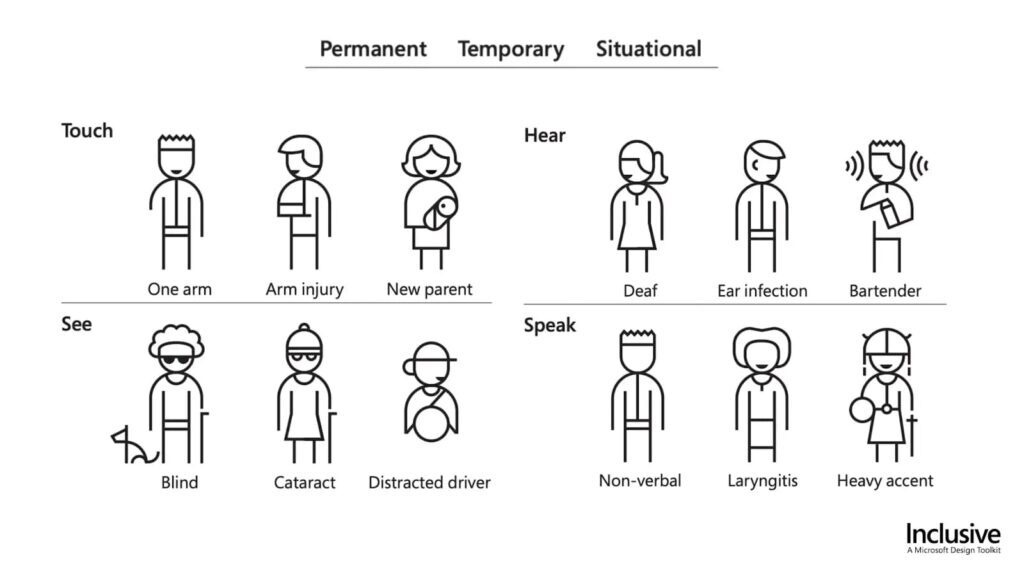
As CDC Director Dr. Coleen Boyle noted, “At some point in their lives, most people will either have a disability or know someone who does.” Whether temporary or permanent, visible or invisible, these realities should be part of how we plan, not exceptions to account for later.

Practical Strategies for Testing Accessibility
Not every team has access to dedicated accessibility experts. However, all teams can incorporate inclusive practices into their design process. Some of the strategies we’ve used and recommend:
- Visual Accessibility: Use contrast tests, check for legibility in different lighting, and follow WCAG guidelines
- Cognitive Accessibility: Use plain language, limit jargon, and offer information in multiple formats
- Sensory Considerations: Reduce visual clutter, dampen sound, and provide quiet zones or sensory-friendly options
These are not high-cost interventions—they’re habits that improve design for everyone.
Designing for Equity Is Collective Work
Equity isn’t a solo pursuit. And it isn’t a finish line. It’s a mindset—a commitment to stay curious, to prototype boldly, and to keep listening. It’s about how we show up: in our workshops, our research, our collaborations, and our decisions.
We offer this piece as an invitation to share, learn, and push the practice together.
Let’s Keep the Conversation Going
Whether you’re early in your journey or decades in, we’d love to connect with others working at the intersection of access, equity, and service design. What have you learned? What are you still wrestling with?
Reach out to collaborate, swap stories, or explore this work more deeply.


