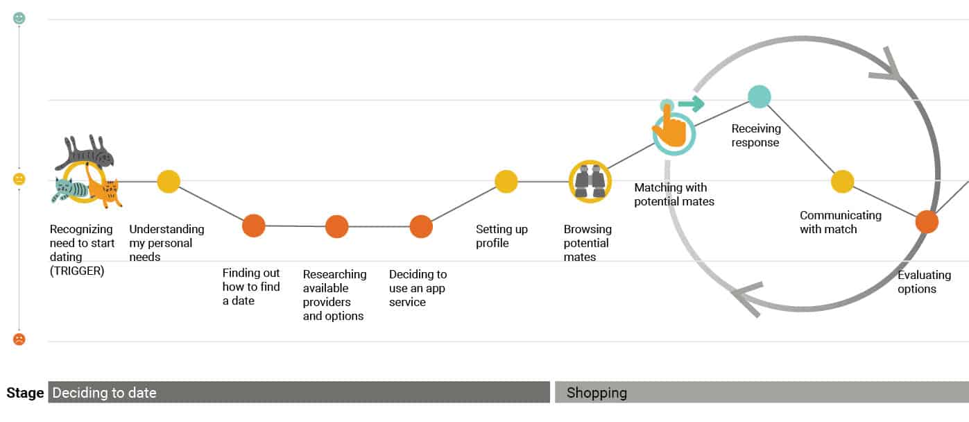
As a service designer, you begin to see design best practices in all facets of your life–negotiating a cable bill, returning a rug, and even going through surgery. Design best practices such as expectation setting could have cleared up some confusion on the day of my surgery. When they inexplicably offer you one or two blankets at check-in—pick two, it’s cold in recovery! Similarly, recent experiences in swiping have shown me that a little bit of service design know-how can go a long way in one’s dating life. Through extensive qualitative and quantitative research with a smattering of ethnographic observation, I’ve compiled a list of good design best practices that we recommend to our clients for their services that are also applicable to one’s journey through swiping.

Deciding to date
The dating journey kicks-off for a multitude of reasons, be it a not-so-gentle nudge from a mom, moving to a new city, or the third cat adoption. In service design, we identify the trigger as the starting point of the journey. A trigger is the starting point on a user’s journey to a goal or need. I have seen people with very aggressive goals associated with wedding mood boards. You could do that, but my advice is just to try to have fun (you’ll at least have a good story for a journey map).
Shopping
It’s 2020 and most couples are now meeting each other online. Current dating apps let you swipe through a myriad of potential mates, allowing you to self-filter out gym selfies. You might use the same strategies as you would finding shoes at Madewell as you step into the shopper role for potential dates. After lengthy or not-so-lengthy periods of time spent browsing and conversing, you decide to meet someone. You browse, consider options, put items in the cart, and then stop there in favor of more me time! Or maybe you just simply can not date another person who says “work hard, play harder.”
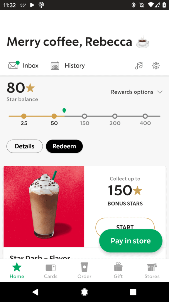
When communicating with your date, you might notice they prefer to talk on the phone before meeting, others might prefer texting with the help of a few appropriate emojis. With our design clients, we stress the need to consider channel preference when it comes to communication. We determine which channel or channels are appropriate – does the user prefer an in-app notification or an email? I still don’t care for texts from my dentists!
In design, we also look at continuity and consistency. How might we make the journey seamless from dating apps to in-person? Were you able to identify the date or were the photos a bit, well, dated…
Committing to a date
Excellent, you scheduled a date! It is a best practice to reach out and confirm before the date to check if the scheduled time and place are still suitable. It shows interest, excitement, and instills confidence that the date will show up! The pattern of summarizing and confirming (here’s your order, did I get it right?) your Taco Bell drive-thru order or a date is common across most services.
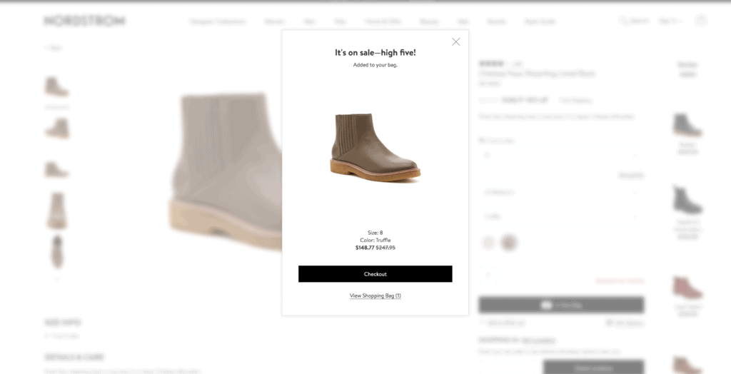
However, confirming a dentist appointment and confirming a date (hopefully) should be two drastically different experiences. It’s appropriate for a confirmation from a dentist to include the appointment with a link to a calendar. But would that design element that fits in the tone of confirming a date? In some cases a clinical tone is welcome—taxes, test results, notes from your accountant, but this is dating and it should be fun and personal. Modern dating is taking on perceptions of it being a chore, so make sure your tone reflects the desired experience (and maybe attach a cute dog gif.)
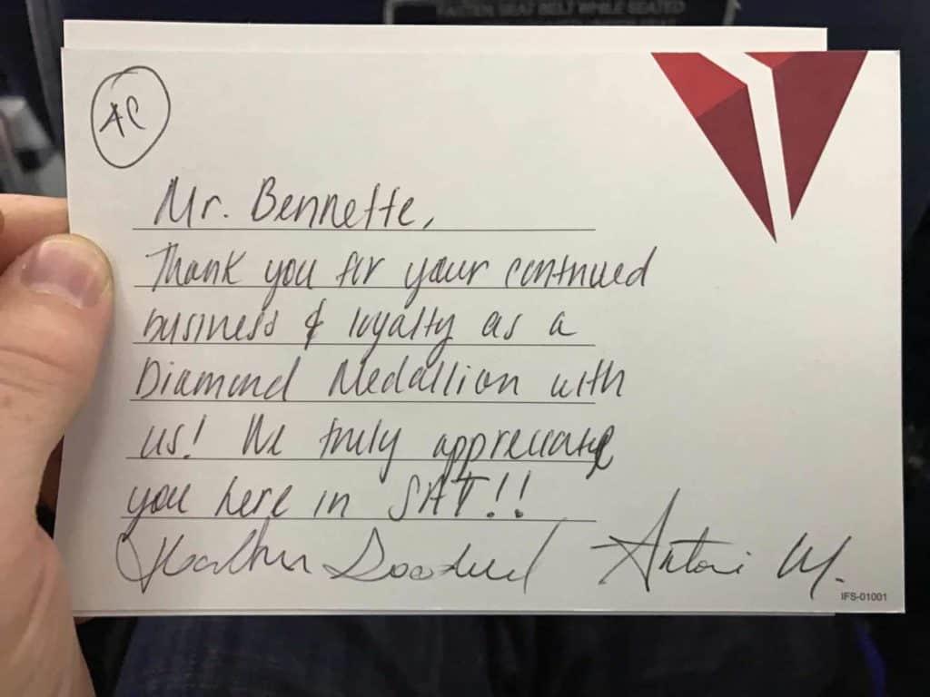
The day of the date conjures up a flurry of emotions. There are nerves, outfits, and menu strategizing (salads, noodles, and garlic should be avoided). Did the date meet your expectations? Were they on time, have a semblance to their profile, and did they wear the free t-shirt from a 5k race 6 years ago? For what it’s worth I have two first date outfits—it frees up my mental load. In every experience, appearance and delivery take center stage and require planning, strategy and many iterations. In regards to service delivery, the devil is in the details. Did the technician have a neat uniform and warmly greet the customer?
So what happens when you set a date for a coffee without realizing that there are two locations and your date ends up at the other one? Designing for error is important to consider. When something is amiss, one has to troubleshoot. Troubleshooting in dating might mean readjusting and negotiating with your partner, providing personal tokens of appreciation, or pursuing competitors. Hopefully, following service design best practices will enable a smooth journey and pave the way for a fun dating experience.
Evaluating
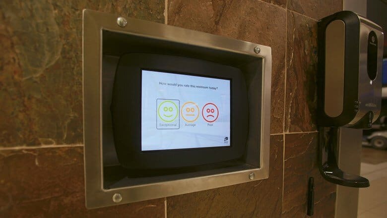
Following up on the date is tricky. You can’t read people’s minds and intentions, and you can’t select to unsubscribe (if you can, please let me know). Services will often ask for feedback, via survey, a rating, even the very unsettling happy face on a touchscreen in an airport bathroom as a source of follow up. I recommend testing for the right method and learning how to incorporate feedback to have a fulfilling and successful dating life and service experience.
Happy Swiping!
Next time you swipe right, remember these service design best practices: have a goal, communicate in their channel of choice, summarize and confirm, match your tone to your goal, be conscientious of your service delivery, troubleshoot, and know when and how to provide feedback. Get the third cat, you can have it all!
