A brand evolution isn’t something to take lightly; further, deciding to take on the brand and design system work yourself is not for the faint of heart. As service designers, it’s not as if we saw Harmonic Design’s studio growth, new working models, and evolved offerings and thought, “Now, we need a new typeface.” However, we did notice that our brand should better reflect the evolved DNA of our practice while being more manageable and systemic to implement across a team of designers. Using service design and decades of branding experience, we set out to co-design our brand.

Well, How Did We Get Here?
… And you may find yourself working on a distributed team
And you may find yourself staring at a brand guide.
And you may find yourself in a fantastic studio, turning five.
And you may ask yourself, “Well, how did I get here?
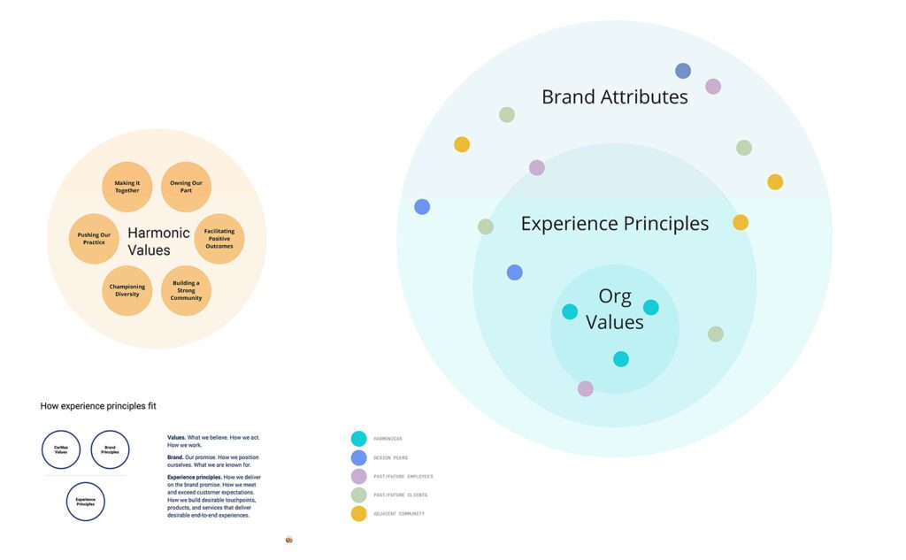
We started by combing through all the existing sources and materials where our brand was explicitly and implicitly defined, characterized, or leveraged. From the inside out, we used leaned on internal initiatives that used our service design methods:
- Activity mapping that clarified the actors, actions, and value delivery
- Defining the “Harmonic Way” in a set of experience principles,
- An internal workshop to clarify our purpose statement,
- A brand attribute workshop to understand how practitioners see our brand
The internal discovery was paired with outside-in efforts to understand how past, current, and future partners and clients perceive Harmonic and the experience of working with us. Namely, we focused on the following:
- Interviews and card sorting activities with clients to learn about how our work and the experience of working together is felt
- Interviews with practitioners to find out how the external perception of our practice differs from the experience once inside
- Competitive audits to see how our practice and brand expression compares and contrasts with other consultancies and notable design practices
Resetting our Principles
These activities helped define our brand archetype. From the shared understanding, we created our brand principles and characteristics. With lots of digital sticky notes to consider, we set out in a small group to create an idea board that reflects each principle, helping us define and then align on a shared visual language –an expression of the personality of our brand.
A note about the principles: We often advocate for teams and organizations to define a set of experience principles to guide their work in imaging and implementing services. A primary reason for an additional set of principles that complement brand values/principles is that we’ve found brand guidelines are often focused on communication and don’t always consider the messy, multi-threaded experience of service. We were lucky to combine thinking into a shared set of principles that reflect the promise communicated in our brand with the proof that is experienced in our practice.
Unflappable (but never detached)
Wear your commitment to holism on your sleeve. Bring energy, optimism, and your full self to bear.
Provocative (but never insulting)
Using logic and wit helps me consider new ideas, connections, and frames. Stimulate me to welcome all perspectives, not just the usual ones.
Wabi-sabi (but never sloppy)
Help me and others become better designers. Recognize we’re all “in process,” and there is beauty in imperfection.
Brilliant (but never in-your-face)
Share your passion for systems, services, and people. Show me not how much you know about design but how much you care about my understanding.
Pragmatic (but never push-overs)
Focus on co-creating real value. Guide me through self-discovery to understand and apply.
Responsive (but never reactionary)
Be intentional in your actions and nuanced in your delivery. Recognize subtext (not just text) and be ready to improvise.
Maintaining the system of the brand
From the onset of our work, it was a goal for our design system to meet a great range of needs of the studio. And designing for designers can, in its own way, be a design challenge. But, we needed it to maintain flexibility while creating enough constraints to match our new way of working and creating consistency across engagements over time. While we still are developing marketing material and communication tools, our brand often lives on a collaborative whiteboard. So, expanding our use of the brand identity to these new digital touchpoints while allowing the design practice to flex the assets in new and interesting ways was a key concern and measure of effectiveness.
This Must be the Place (for Lavenderp?)
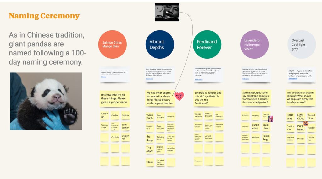
We didn’t want to lose sight that a static guide (no matter how frequently updated) should reflect co-design and be fun. So, when we introduced our new “living” brand guide, we had our studio do a naming ceremony akin to naming giant panda cubs for the new colors. To join the ranks of our fabulously named color palette, we’re welcoming Vibrant Depths. Lavenderp, Ferdinand Forever, Coral-ish, and Overcast.
Colors were not the only change! But we’re adding in typefaces, making adjustments to our logo, and creating and filling out the design system to look at illustration, editorial, marketing collateral, and gobs of templates for external use and practice.

An Evolving Ecosystem
Our brand evolution looked across visual design, principles, and language. Still, to use and develop the new design system, we also needed to approach stewardship in an equally flexible and coordinated manner. To allow our brand to continue to grow and adapt to the needs of practitioners, partners, and clients alike, we’ve established a brand council to tend and nurture the brand forward. We’re putting stewardship front and center by including education in our tools and templates, a feedback form, communication plans, and scheduling key moments for updates and reflection. By establishing a path and cadence for feedback, we’re confident that we’re less likely to find ourselves here again on the cusp of our tenth anniversary and instead can evolve at the scale of service.


